Site Accessibility Best Practices
Site Accessibility Best Practices
Tips and Tricks for implementing Web Content Accessibility Guidelines (WCAG)
Summary
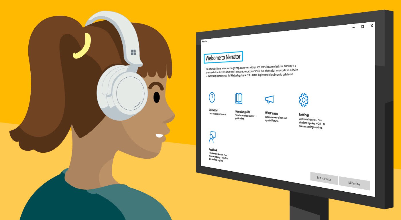
As the websites, and the digital services they provide, reach more devices and users each year it’s imperative to focus on making the web accessible to all users. The Center for Disease Control places disabilities among Americans at 1 in 4, with an estimated 1.3 billion people internationally that suffer from visual impairments. For most of these users, digital content is only consumable via a screen reader such as JAWS (Job Access with Speech) or Windows Narrator. For other users, physical limitations may require the use of a keyboard without a mouse, in which case using “tab” to navigate a page is necessity.
Official Guidelines
As support for accessibility in the digital landscape grows, as do the guidelines provided by agencies that track the needs of these users. The main reference for this movement is a global standard known as the Web Content Accessibility Guidelines 2.1 (WCAG). Per WCAG’s mission statement, WCAG “covers a wide range of recommendations for making Web content more accessible”. These guidelines exhaustively cover all major and minor accessibility improvements and grade them in conformance from A (lowest) to AAA (highest). Some simple examples include:
A: Color is not used as the only means of conveying information
AAA: Sign Language Interpretation provided for audio-only media
A site can be graded using these guidelines based on how much accessibility is built in. In some cases, this can be a sliding scale for how much functionality is available. For example for keyboard navigation:
A: If keyboard focus can be moved to a component of the page using a keyboard interface, then focus can be moved away from that component using only a keyboard interface
AA: Any keyboard operable user interface has a mode of operation where the keyboard focus indicator is visible.
AAA: All functionality for content is operable through the keyboard
Klish Best Practices
At Klish Group we’ve had the opportunity to work on sites that strive to reach AAA accessibility ratings. Planning for accessibility needs to be done early in the design phase and can effect everything from the color palette to how site navigation is handled. So when it comes to component design, we’ve developed a set of best practices to help ensure the guidelines are adhered to.
-
Adding in hidden “Accessibility Labels” alongside Call To Action buttons for screen readers (can also use “aria-label” to accomplish the same task, more below)
<a href="\#">Donate Now <span class="visually-hidden">to the American Red Cross Relief Fund.</span></a> -
Human-readable custom ID fields for tables and complex web elements.
<table class="location-comparison-chart__table data-table"> <caption> <span class="visually-hidden">This is the summary for this data table! This is typically visually hidden.</span> </caption> <tr> <td> </td> <th scope="col" id="hospital-location-table" class="locations-table"> <span class="visually-hidden">Current Location:</span> North Hospital Location </th> <th scope="col" id="south-hospital"> South Hospital Location</th> <th scope="col" id="east-hospital">East Hospital Location</th> </tr> </table> -
Providing “alt” text for all image tags. Adding the alt attribute addresses a handful of cases:
-
ALT tags can be used for keyword identification related to the image, which can be leveraged by search engines.
-
If an image cannot be displayed for some reason the ALT text will replace the image, giving the user an idea of what should be shown. These tags can also contain links to other pages/image to provide additional information
-
ALT tags provide a text alternative of the image for users on screen readers. Example:
<img src="img_girl.jpg" alt="Girl in a jacket"/>
-
-
Using the Accessible Rich Internet Applications (ARIA) for providing extra context. Example:
<nav aria-describedby="utility-nav-title" role="navigation" class="utility-nav">In this case “role” is defining that this is a navigation-specific element and “aria-describedby” contains a descriptive name to identify this as a navigation bar for Utility links.
-
Using “Skip Navigation” links to allow screen reader users to bypass large blocks of navigation content. Example:
<div href="#skipContent" class="visually-hidden" id="sidebar-navigation-title">Skip navigation</div> -
Placing Navigation elements as close to the top of the DOM structure as possible aids with skipping sections of navigation. Otherwise by providing the above “skip navigation” button you risk skipping vital page content, like article titles.
-
Use tools to validate compliance:
-
Color Contrast Application - this can even be used during Design to test in PDFs or Figma.
-
Example Sites
Here are some sites that the Klish team has worked on which adhere to some of the best practices: